
The Tour de France logo has been around for the last 15 years, but has it aged like a fine French wine?
This July, the iconic Tour de France logo will emblazon cycling’s most grueling stage race for the 15th consecutive year. When the 176 masochistic riders roll through Île de Noirmoutier, a small island just off the French Atlantic coast, to begin the 105th edition of Le Tour, the event will showcase one of the most unique, fun and enduring logos in sports history.
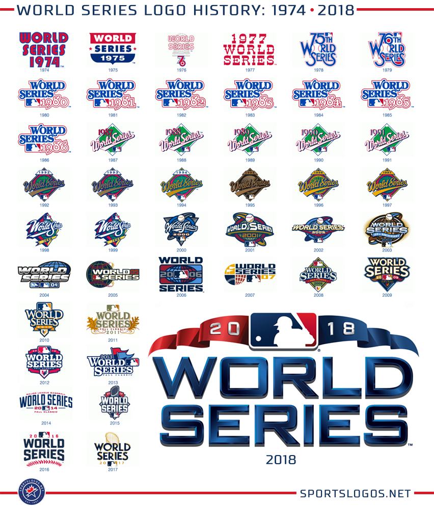
Fifteen years is a long time for the life of a sports event logo. Usually, there are subtle tweaks and alterations, if not outright rebranding by the time an event ever reaches a decade of tenure. But Le Tour de France logo has successfully bucked that trend. As an example, the Baseball World Series alone has had at least two dozen different event logo styles since 1974. That’s an average of a new logo design almost every two years!*
So what has given the panache-and-swash Tour logo its unusual longevity? Plain and simple, the designer achieved a rare combination of trendiness and timelessness that not only includes a delightful visual trick but brilliantly infuses the personality of the host country into the design. And you’re right, that doesn’t sound plain and simple at all. That’s exactly the genius of the solution created by French (of course) designer Joel Guenoun.
The typography style is classic brush script and looks like it could have been painted by a master French artist like Monet or Toulouse-Lautrec. Even if the word France were removed from the design, the Gallic personality of the lettering would still be unmistakable.
![]()
But the real beauty of the lettering is the flawless transformation of the “O-U-R” letterforms into the shape of a cyclist leaning forward to challenge the Tour’s relentless forces of gravity. And, in an inspired solution, the lack of a letter to represent the front wheel of the bike is overcome by the inclusion of a solid yellow circle that inspires images of the French summer sun. Naturally, the bright yellow accent color is also a nod to the famous yellow leader jersey worn by the front-running rider during the race, and by the eventual Tour champion.

With a series of simple color variations developed to apply the logo to differing backgrounds, and an admirable history of adhering to brand standards, the logo seems as fresh today as it was back in 2003 when it was introduced.

So sit back and enjoy the 21 back-breaking stages of this year’s Tour de France from the comfort of your own couch or easy chair. One thing’s for sure– there’s not a chance you’ll be bored. By the race or by the logo. C’est magnifique!
–SBJ
Let us know what you think! Sports Brand Jury welcomes your opinions, comments, and suggestions for future cases. If we use your ideas for a future post (if we haven’t already planned on it), we’ll send you some SBJ swag as a thank you.
- World Series logos were made especially easy to evaluate by Chris Creamer and his amazing sportslogos.net website.